Color with intention: give every hue a job
Seven photographs show how to organize strong color, preserve quiet tones, and decide where an edit should stop.
 View this photograph & print options →
Seven photographs show how to organize strong color, preserve quiet tones, and decide where an edit should stop. These examples use finished photographs to study visual decisions; they do not identify the original exposure settings or prescribe identical edits for every image.
1. Name the color relationship
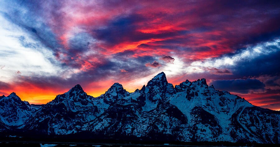
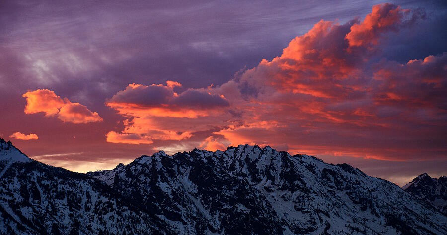
In the crimson mountain scene, warm sky and cool land create a clear division. Before opening color controls, describe that relationship in one sentence. Is the photograph about warm against cool, one dominant color, or a small accent? Use the answer to guide the edit. If every color becomes equally intense, the original relationship can disappear even while the picture looks more dramatic.
2. Protect the brightest color
The rose-colored clouds are the visual event here. Increasing saturation without checking the brightest areas can reduce subtle variations to broad patches. Inspect the histogram and individual color channels when your editor provides them, then check the clouds at a useful viewing size. Lowering exposure is not automatically the answer: compare highlight recovery, local adjustments, and a gentler color treatment before darkening the whole scene.
3. Keep a reference for neutrality
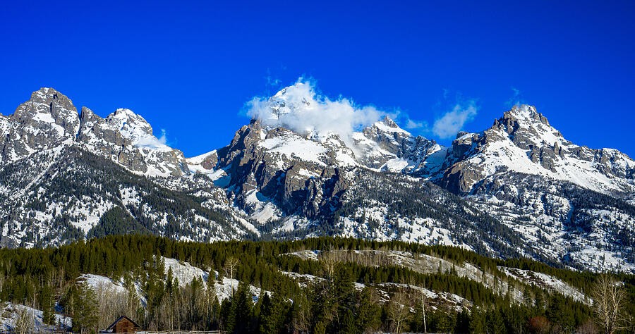
Snow, pale rock, and clouds give you useful references when evaluating a strong blue sky. They need not be perfectly neutral—light itself has color—but a dramatic global white-balance shift changes all of them together. Compare a restrained version against your stronger edit. Ask whether the mountain still feels illuminated by the same light as the sky, rather than correcting each part in isolation.
4. Let one color carry the scene
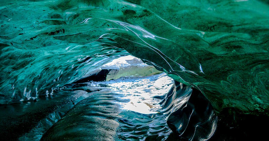
Inside the ice arch, related blue-green tones are enough to hold attention. The variation comes from brightness, curvature, and texture rather than a large palette. Try reducing competing hues before increasing the main color. Keep some areas subdued so the light opening retains its role. A mostly single-color picture still needs separation between its dark surfaces, midtones, and brightest details.
5. Preserve subtle differences
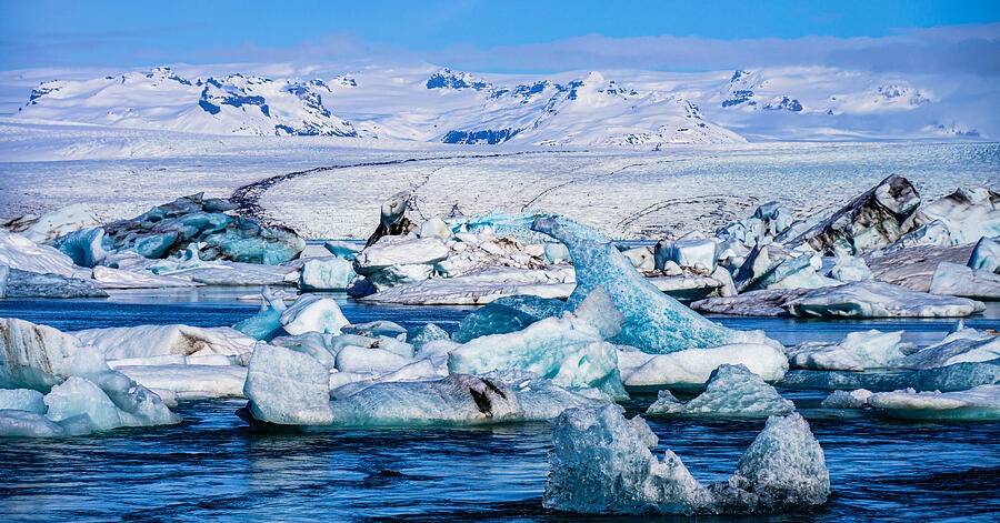
The lagoon contains many versions of pale blue. Strong contrast can make the ice easier to see while also losing its delicate transitions. Examine one ice shape at a time: can you distinguish its lit face, shadow, and reflection? Adjust locally when one area needs separation. Do not assume every pale scene needs more saturation; a restrained palette can convey cold and distance convincingly.
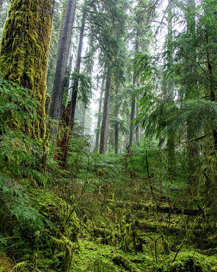
6. Treat green as a range
A forest contains yellow-green highlights, cooler shadows, and earthy bark. A single saturation move treats all of those relationships alike. Compare the foreground moss with the distant trees and let atmospheric distance remain visible. If the background becomes as bold as the foreground, reduce the adjustment or narrow its range. Check that pale trunks have not gained an unintended color cast.
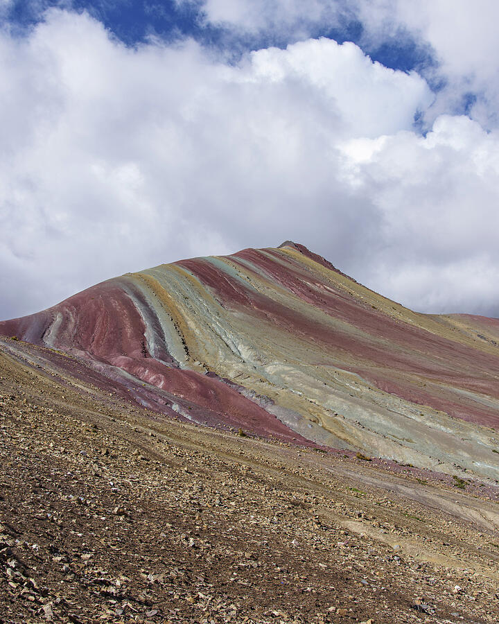
7. Know when the landscape is enough
Rainbow Mountain already has distinct bands of color. First decide whether your edit makes those bands more legible or merely louder. Compare at thumbnail size, then inspect the boundaries for halos or abrupt shifts. Keep a quieter version beside the stronger one. The useful question is not which version is most colorful, but which version best preserves the photograph’s structure and mood.
Put it into practice
Choose three images with different palettes. Make a restrained edit and a stronger edit of each, keeping crops identical. Compare them at thumbnail and full size, then use the image comparer without looking at the filenames. Write down which areas attract your eye first and whether that matches your intended subject. Keep the version that supports the subject, not simply the one with the highest saturation.